Cerveja Polar
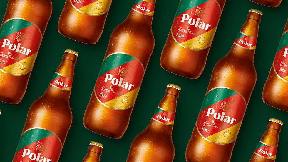
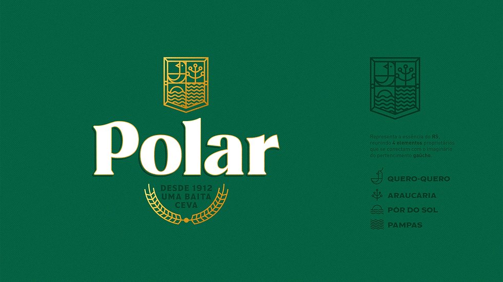
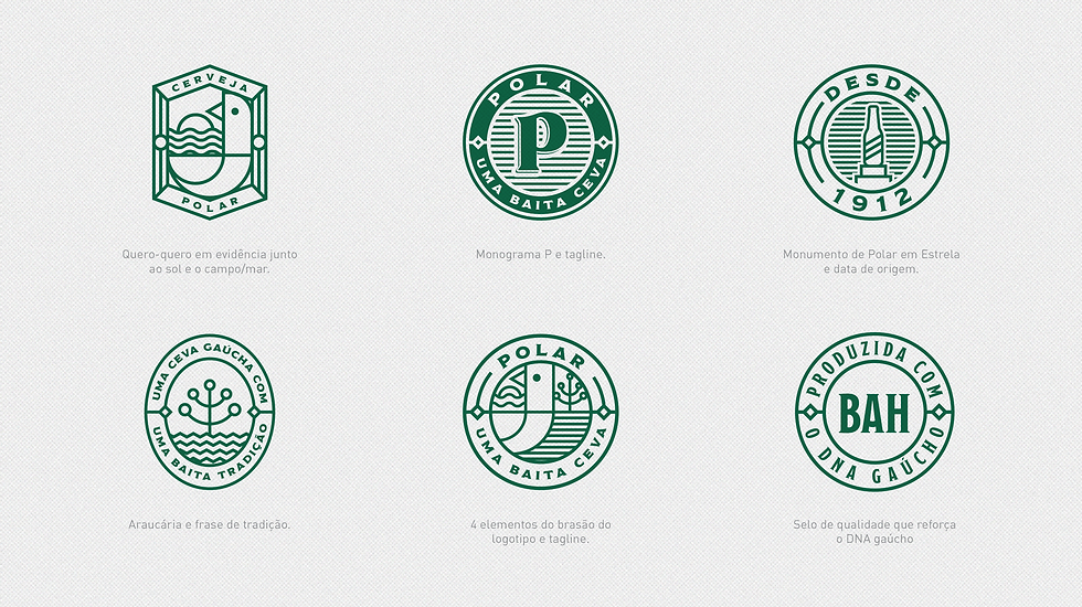
How to make Polar relevant again to the "gaúcho" market, after 12 years of visual stagnation? Polar brand and packaging redesign that reflects the personality, essence and strategies of the company, being modular, generative and adapted to its new graphic universe. With great care not to hurt the gaucho pride, we redesigned Polar's brand and packaging, maintaining its gestalt, but bringing codes that justify the tagline “the best is here (from the south)”. A coat of arms with classic elements from the south such as the souvenir, the araucaria, the sunset and the countryside. A more contemporary typology that carries history, maintaining the serifs and details, such as the angles of the letters O and A. The background, now matte, continues to illustrate the flag of the State of Rio Grande do Sul, but with adjustment of proportion and tones.
client
Ambev
expertise
visual identity packaging


